Flowstone’s Wine Labels
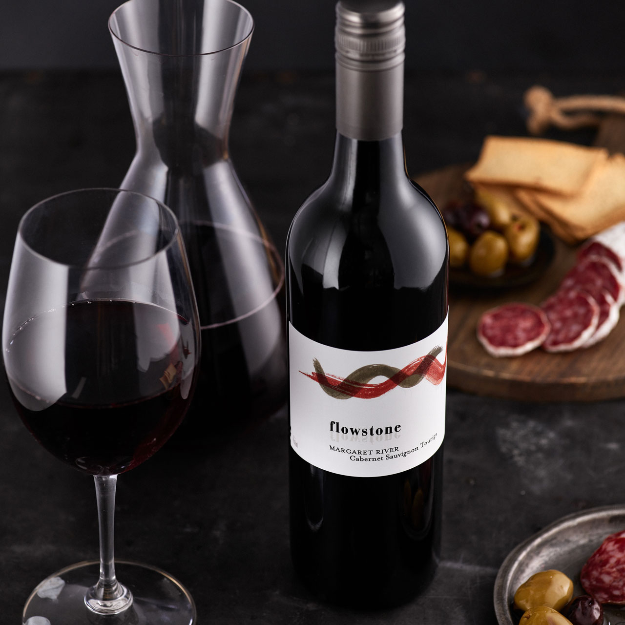
From the very first time we released our Flowstone wines, the distinctive label has always created some discussion. Most of the time, the feedback is positive, but it never always is with a wine label. We had a clear vision to let the label tell the story – distinctive and memorable yet with a connection to the land from which we source our grapes.
When designing our label, we felt that it really needed to reflect our brand vision and identity, which centre on the local caves in our part of Margaret River. At previous companies, we have worked with label designers before and chose to go with Steve Boros, Design Director of braincells, with whom we get along well and who has created some of the most iconic Margaret River wine labels.
We gave Steve a brief of our brand beliefs and some very general label requirements. It was important to retain the classic label structure of an essentially white label, with a centred logo and symmetrical text beneath that. The rest was up to him.
The current Flowstone label is what he came up with, and we were very happy. But it’s the story behind the design – such as the stock and the significance – that has deeper meaning. It often evokes an aha moment from our wine club members as they dig a little deeper.
The Elements of the Flowstone Label Design
The Flowstone label is a striking expression of modern styling on a classic label structure, as we requested.

The curvy brushstrokes represent the two landscapes – that is, the cave landscape so key to our inspiration, and the vineyard landscape. The constant grey brushstroke is the cave landscape, while the changing-colour brushstroke represents the vineyard landscape, with the colour changing per wine variety.
The wavy nature of the brushstrokes not only obviously mirrors the Margaret River horizon, but also represents the flow of water through both landscapes.
The reflection of the Flowstone wording is inspired by the stunning reflection in the lake at Lake Cave, and the original name for Lake Cave was Queen of the Earth. This certainly explains where we get the name for our premium wines – an inspiration that is as profound and majestic as our wines are, and a part of our environment.


Sustainable Wine Labelling
To complete the mineral and cave connection, we print the labels for Flowstone wines on a limestone-based label stock. The stock is 81% limestone, with the balance a natural resin to bind it together. There is no wood fibre or pulp in it at all. Thank you to our label designer for recommending that!
The Queen of the Earth labels were originally similar to the Flowstone labels, differentiated by the paper they were printed on, and the inclusion of this stamp:

However, a few years ago, we decided to differentiate the labels even further. The new design took inspiration from a piece of artwork in our house that we had done to reflect the local environment’s atmosphere, caves, soil, vegetation, water flows … just the whole space! It was a piece of art by a woman named Deb Zibah, which she called ‘Typhoon’, and it has pride of place on the wall in our house. It is very textural and emotive, so a wonderful challenge for the label designer and printers. They have all done a fantastic job, and we couldn’t be happier.

Wine labels are tricky things, very much subjective, and we never expect everyone to like them. At a bare minimum, we want to like them, and we do!
So next time you pour a glass of your favourite Flowstone wine, you can understand a little more of the story behind the designs. On that note, I think it’s time for a glass of wine.
Find out more about our Margaret River Vintage 2021 Summary


